
Typography is all about making written text legible and appealing, drawing in a readers attention and keeping it. A good example of Typography is the “Chanel” Logo. It is iconic, therefore easily recognised, even by those who are not interested in fashion. The sans-serif typeface, and the even spacing between letters, makes the logo easy to read and invokes elegance, luxury, and sophistication. Everything that the Chanel brand stands for. First, the logo’s use of typography is rooted in minimalism, a hallmark of Chanel’s design philosophy. The clean, symmetrical interlocking letters aren`t overly ornate but instead focus on legibility and clarity. This simplicity allows the logo to transcend trends, contributing to its enduring recognition. Over the decades, the logo has remained largely unchanged, demonstrating the power of a well-designed typographic element to stand the test of time. The bold, curvaceous nature of the “C”s complements the elegance of the Chanel brand. The smooth, balanced shapes evoke a sense of refinement and luxury, aligning perfectly with the brand’s image as a high-end fashion house. The letterforms themselves are often associated with the Art Deco period, which was influential during Chanel’s early years, further embedding the logo within the historical context of its creation. The Chanel logo also demonstrates the value of visual identity in building brand recognition. Through its simplicity and unique, yet familiar, design, it can be instantly identified without the need for additional text or imagery. Making it a typographical success and a powerful branding tool, demonstrating how effective typography can convey a brand’s essence with minimal effort. In conclusion, the Chanel logo exemplifies how typography can go beyond mere communication to evoke emotion and establish a brand identity. Its timeless, elegant design is a perfect example of the strength of well-executed typographic principles in creating lasting visual impact.
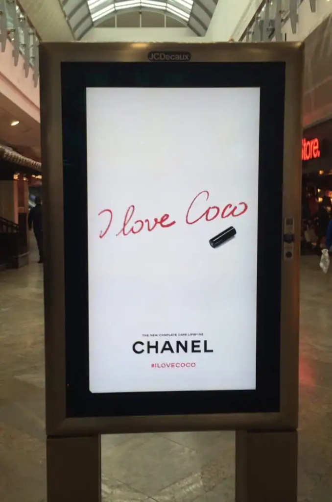
This design from Chanel is a great example of bad typography. The font makes reading the text difficult, and easily misinterpreted. The sign shown above is read by many as “I love cow”, the only saving grace is the smaller text below the Chanel logo with the hashtag “I love coco”. This is easily fixed, if the colour scheme is a must have, then the font itself is easy to change. At the same time, if the font is supposed to look like handwriting, then there are fewer options that allow for legibility. In order to fix this sign, I decided to keep the red colouring, as it does help the text stand out from the white background, while differing from the black font of the company logo. From there I changed the font type, again trying to stick as close to the original design as possible, I struggled finding a font that was legible and suited the original design scheme, so instead I used my own handwriting as a replacement. I decided to do this because finding a font that matched the style that the sign was going for, while also being legible, was difficult, and the same font obviously wouldn`t work with just changing the font colouring. A few font options that I tried did not look as good with the red colour, so my own handwriting was a good replacement, and writing the text myself gave me more freedom of redoing it until the text was legible, while maintaining the style of the sign. Another change I made was to the shade of red. I chose a lighter shade to make the text stand out more. The redesigned version is seen below.

Comments are closed